


As a consultant, I led a large team of UX designers within the B2B division for a large enterprise telecom.
The client’s goal was to decrease the division’s budget and our approach for helping them achieve this was to offer a managed service model with an offshore team who would work around the clock in shifts for faster turnaround time on deliverables.
The client also made other major shifts, specifically moving away from waterfall and “wagile” project management methodologies to the SAFe Agile methodology.
As a large enterprise telecom, the client’s Business Digital Experience division has multiple business product offerings. It also has worked in silos across these business platforms for decades which created variations of design standards and workflows.
This made it quite a challenge when our consulting firm took over the contract from a competitor and had no runway or training to understand the complex system of process and design workarounds.
The other challenges were that the guidelines had more exceptions than rules and the processes weren’t documented.
After an initial period of scrambling to learn the differences between these design standards, we were able to get the systems down. Leading a team of 17 junior and mid-level offshore and 2 US designers, most of the work first started out with production work – comps and redlines.
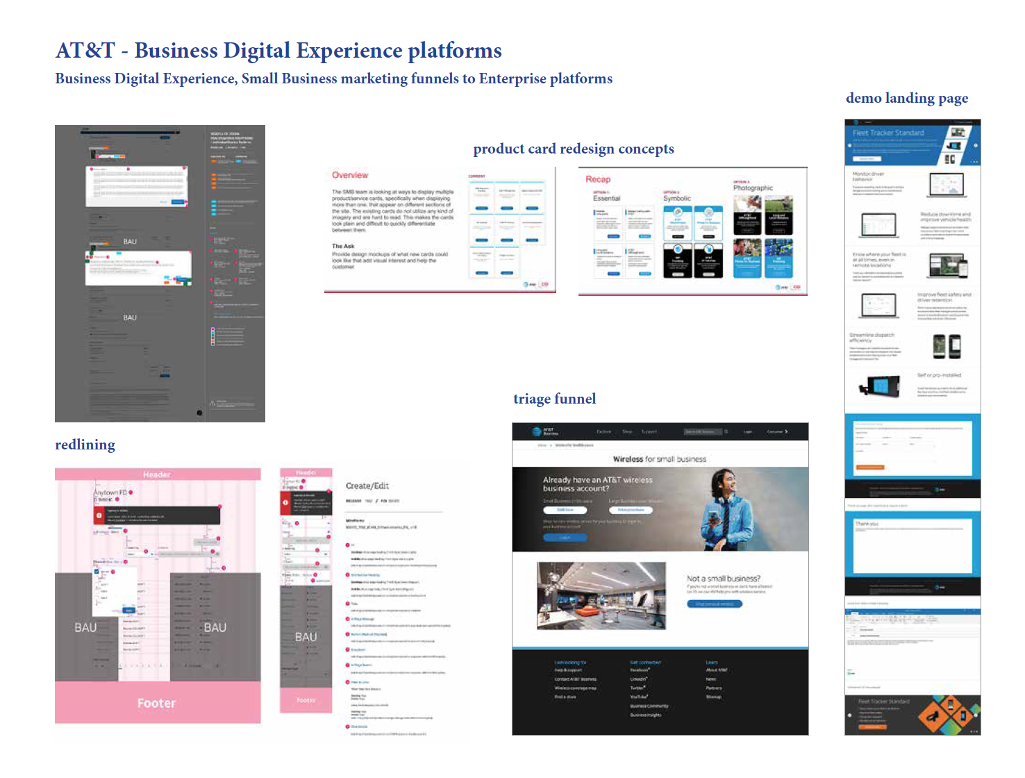
These “redlines” (CnRs) were important to get the pixel perfect deliverables to the dev team so there would no “misunderstandings” of how the pages should be built.
Some of the mid-level to senior offshore designers were then called upon to start creating user flow pages from scratch.
Although seemingly simple, this designer was able to create a user flow for a very complicated B2B user experience project.
This was one of the first wireframe projects to be created from the ground up by our new team but was not without its fair share of blood, sweat, and tears.
What made this project so difficult, although it only affected a few pages, was that the platform utilized a hybrid system of design standards. It was also the first time the designer was creating hi-fi wireframes from scratch.
And of course, the additional challenges included communication between an offshore designer and a mix of business owners, project managers, and platform design leads on the client side and from other vendors over Webex meetings. This took dozens of additional calls between myself and the designer to make sure the business requirements and design guidelines were understood.
Unfortunately, this first project ended up behind schedule. We were also heading into the holidays and many of the key stakeholders were beginning to be out of office for vacation. It became clear that the senior designer I had assigned this to just couldn’t understand what was being said in meetings (his visual design skills were great but English language skills not so much), and I had to re-assign the project to another offshore designer – a more junior one who was also familiar with the project but had better communication skills.
Luckily, this other designer was able to turn the project around quickly - he started on Christmas Eve and finished it the day after. It was a Christmas miracle!
One of the client’s business platforms was originally designed by another design firm whose work did not quite live up to the client’s exacting design specs. There were also more basic issues of user experience that were overlooked completely. So for this business product offering, we paid special attention to every detail from the making sure to use the correct custom complex tables and to ensure the site’s sorting functionality was behaving as expected in accordance to the product’s design standards. Additionally, we wanted to make use of the platform’s… er, “exciting”… flyout component which could be used to add some dynamic functionality to this simple site within a quick turnaround time.
There were a small number of “Information Architect” contractors from the previous firm that we retained for a few months in order to make the transition to a managed service of production designers a little smoother. However, we learned pretty quickly that neither the IA contractors were “real” IAs nor were the offshore visual designers real UX designers. This realization also launched a thousand conversations about what the term UX designer and IA means and which definition of these roles were the correct ones.
It was later decided that our firm had hired a slew of visual designers who would need more training and mentoring in user experience and only 3 Senior UX design contractors who could create the user flows, site maps, and lo-fi and hi-fi wireframes.
To help get the visual designers’ feet wet, I paired a few of the junior to mid-level designers with the senior IAs. The designer was able to create wireframes from scratch for a new login page for the main business portal.
Our scrappy team then made a splash with landing pages pretty quickly since it was more in line with their previous work experience with B2C marketing campaigns. Not surprisingly, they were able to create marketing style splash pages much more easily than the more constricting redlines since this offshore team of Indian designers could interpret the pages more freely.
Another example of splashier landing pages that were also responsive.
More splash pages that displayed location-based images depending on the site visitor’s nearest city.
To help develop and better assess the team’s UX skills, I created 3 different design challenge projects and assigned each challenge to a group of 3 more experienced designers on the team who I felt were ready to move into Senior UX design work (or IA as the client calls them). Each designer had to create his/her own design deliverable which included either user flows (to get the used to thinking logically about the user’s journey within an environment), redlines (to test their adherence to design standards), and suggestions for new features (to help them understand business requirements and user stories product owners might give them), or a combination thereof based on their experience level.
One designer had a very clear and simplified way of visualizing a process diagram for non-technical stakeholders.
Another designer had a different interpretation – he included his initial process diagram and then elaborated on it in a very fun way for stakeholders to understand and that would engage them.
And another designer included his hand-sketched diagram. He then included a more visually engaging version to grab the attention of stakeholders.
One of the other design challenges, which was assigned to the junior designers, was to create a typical redlines document… but with a twist – include a new product feature of their own creation!
She created a new feature that blocks spam calls. Toggle me YES for that feature, please!
This Design Challenge assignment was given to junior to mid-level designers to test their understanding of product messaging with respect to both visual and copywriting content.
In my opinion, designers and writers should work together collaboratively in order to iterate quickly and successfully. So this project tested the designer’s ability to read and choose content pieces that made sense for the product offering and to select appropriate imagery that would speak to the small business user.
This was also a testing ground for proving that the client’s current culture of having writers and designers working in their own silos was causing delays and less impactful experiences for the user.
Additionally, I have been working with the content team to streamline the content writing process. So far, our new approval system, which involves having the CRD generated by the content writer from an Axure wireframes file into a Word file for submission to the legal department, decreased the turnaround time for content approval.