


An arts incubator in Dallas whose mission is to provide the resources emerging artists need to be successful. As a fledgling non-profit startup with strapped resources, the original site was more of a placeholder with little content as the mission and vision were still being hammered out.
With zero budget for a redesign, it became clear I was stuck with the Squarespace template the founders had already selected. Not having used Squarespace before, this out-of-the-box, cookie-cutter solution was quite a challenge due to its limitations in the name of “simplicity of use.”
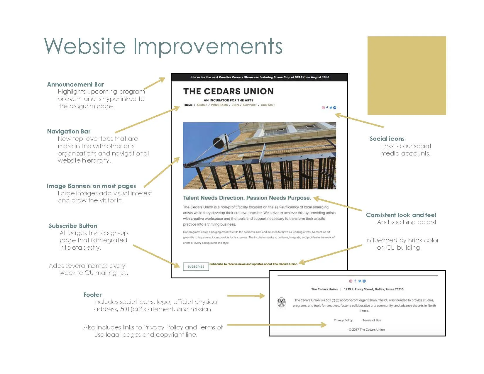
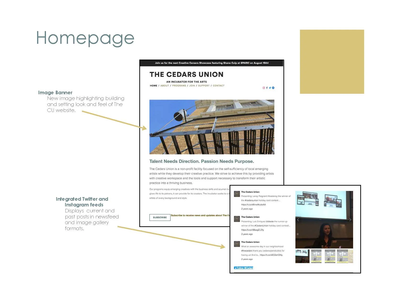
I then worked to organize the information needed and to get a consistent look-and-feel based on existing branding guidelines that had no real color palette because the color accents were supposed to come from the big colorful photographs expected to be used. This was quite a challenge – the organization was still so young, and the new facility’s remodel had not yet begun. Therefore, I had no photography! I used what I had as well as free stock photography with the intent to immediately replace it as soon as construction was finished and I could get a professional photographer. Other improvements were made such as adding social links and feeds on the homepage. However, like with any website, I expected to make many future iterations.
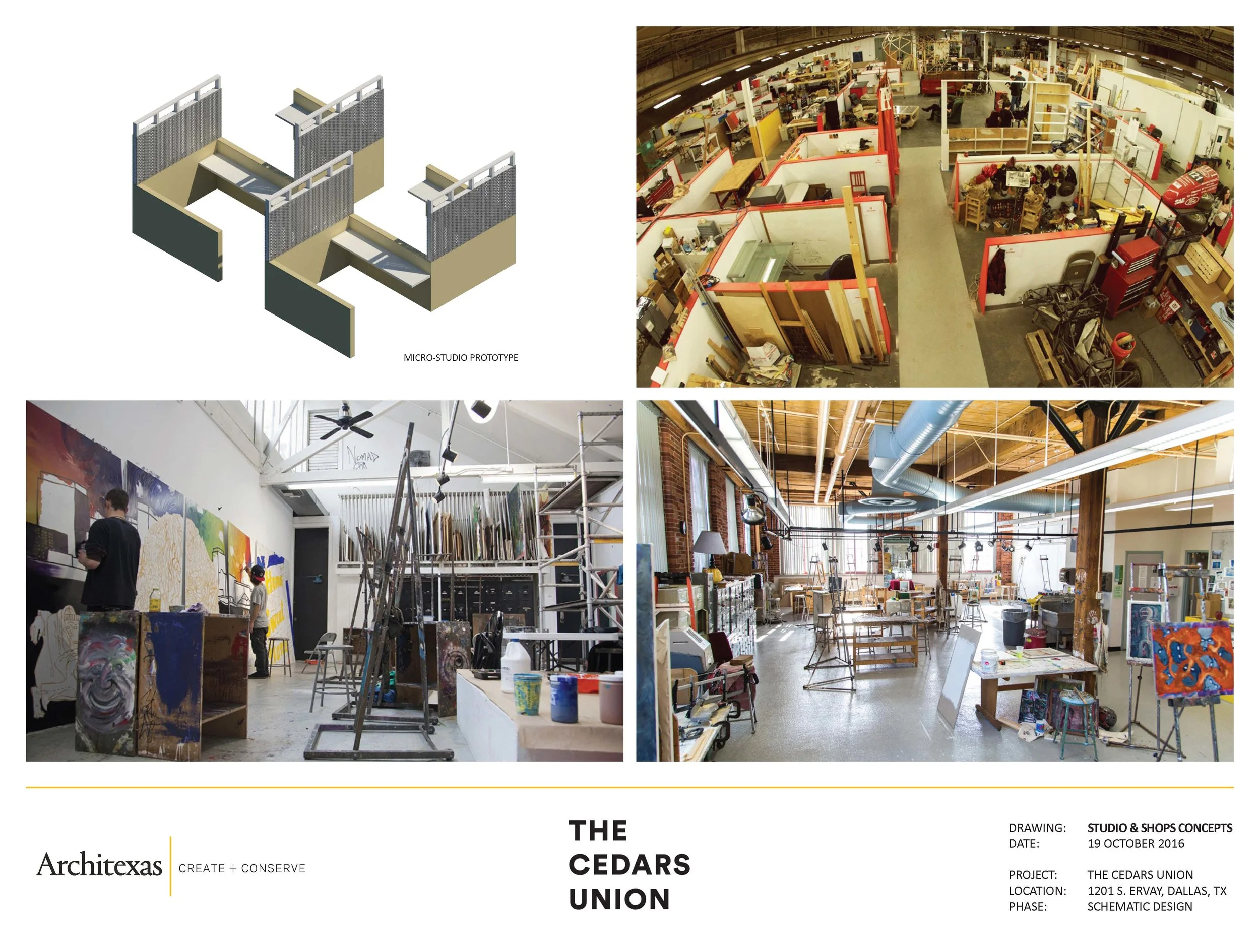
Research for what what the North Texas arts community needs came in phases. The first round occurred a year prior to my joining The CU and consisted of interviews, focus groups, and surveys. After reviewing the surveys, I realized we needed a new round of research. We needed a wider variety of participants so we conducted more focused interviews, artist focus groups, and 2 different surveys (one focused on the offerings of the new facility and the other focused on programming). We used the data to inform the design of all the aspects of the new facility’s open concept: the open micro-studios, shared workspaces, tools list, and community-focused programs. It also was clear that we had 3 different categories of user groups of the future facility, and this also drove the design of the website.
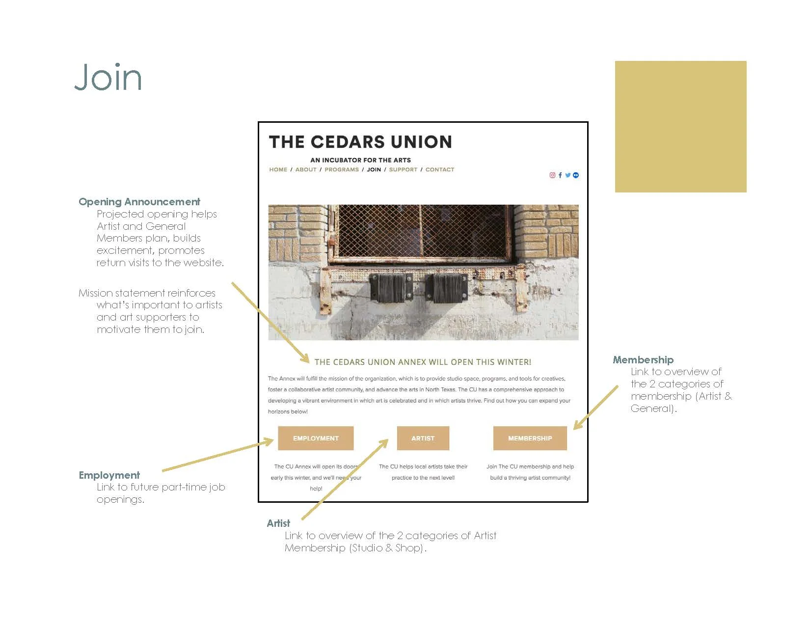
The research also helped us build personas. Keeping marketing and communications efforts in mind as well, the site’s pages always included high-level answers to the two most frequently asked questions from interviews: What is The CU? and When is it opening? As much as possible, I included our mission statement and expected opening date.
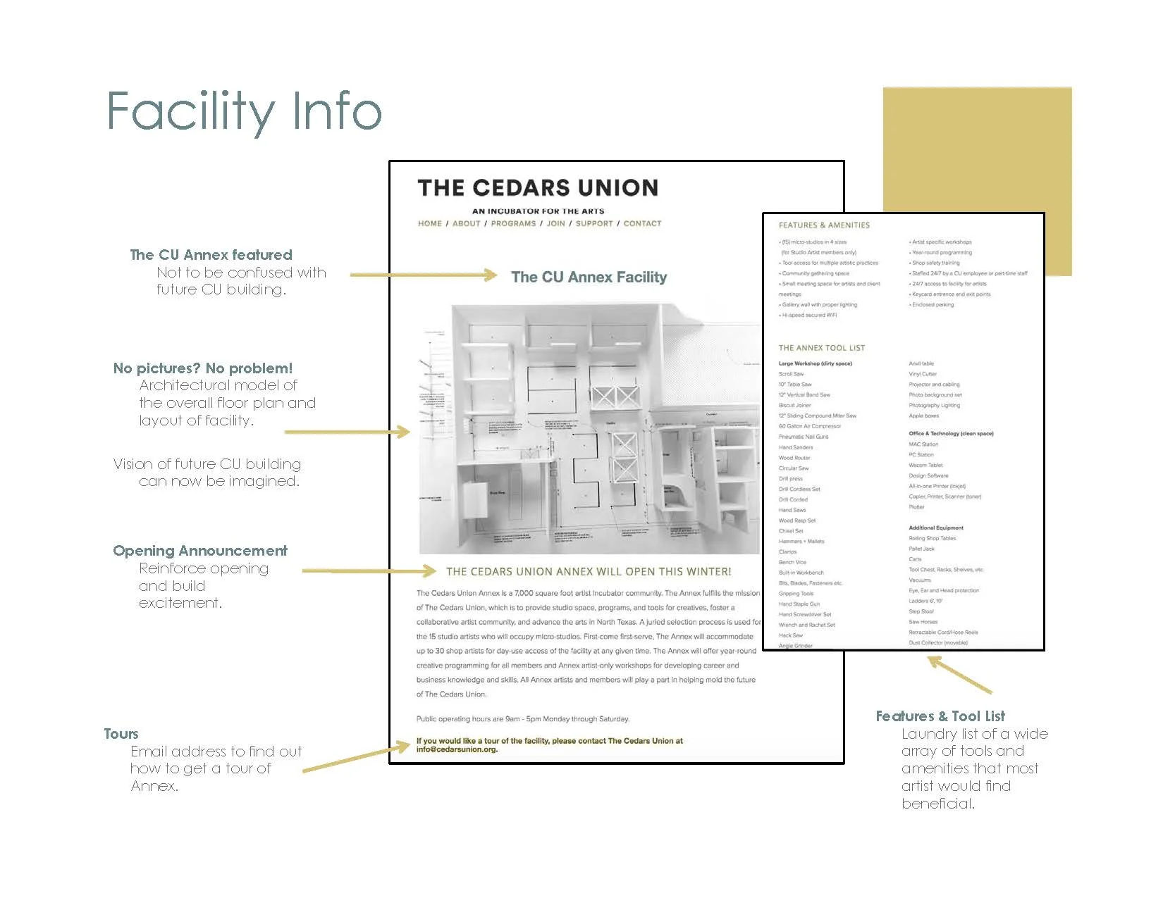
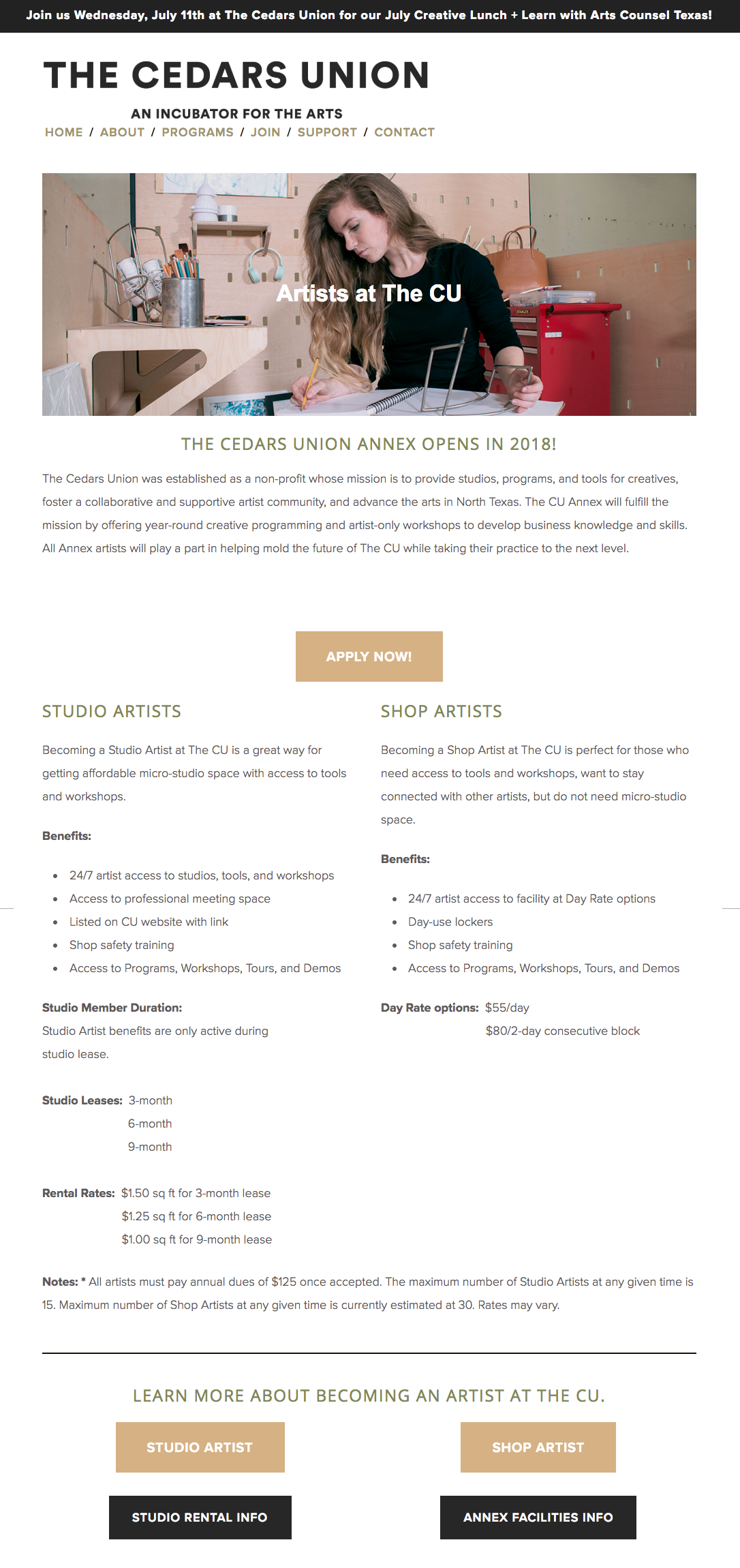
Taking into consideration that we would use many of the pages as links from social media and email marketing campaigns, I continued to include our expected opening date and mission statement. Based on the questions asked during interviews and focus groups, the users coming to this page would want an overview of what the facility will offer artists. Both studio artists (artists who want to rent micro-studios) and shop artists (artists who only want day passes to use the tools and workspaces) would be the primary users coming to this page.
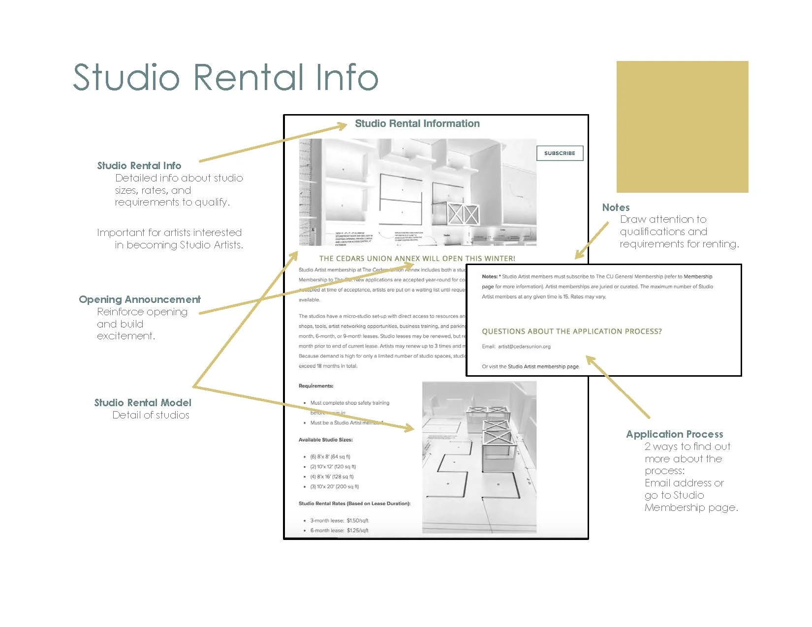
Studio artists might come to this page from social media and email marketing campaigns but also from the Facility Info page. Again, based on the questions asked during interviews and focus groups, the users coming to this page would want more in-depth information about renting studios at The CU.
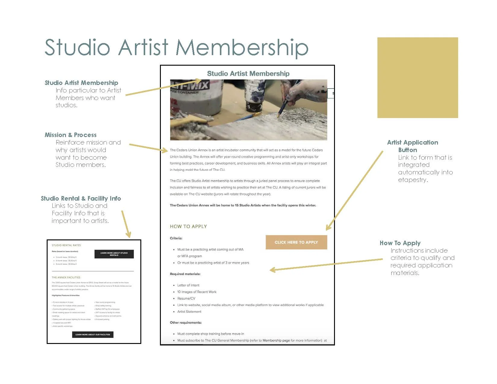
Initially, we developed 2 membership programs: one for artists and one for general membership (other arts professionals and art patrons). With marketing campaigns in mind, a landing page for membership was created with 2 different landing pages: Studio Artist Membership and Shop Artist Membership.
After conducting usability testing, it was determined that these Membership pages, as well as the membership programs themselves as initially developed, were too confusing. Therefore, we decided to scrap the artist membership programs altogether.
I funneled the info through an Artist Info page instead. At this point, we had a full-size prototype built of the micro-studio, and we were able to get some decent photography of it in situ.
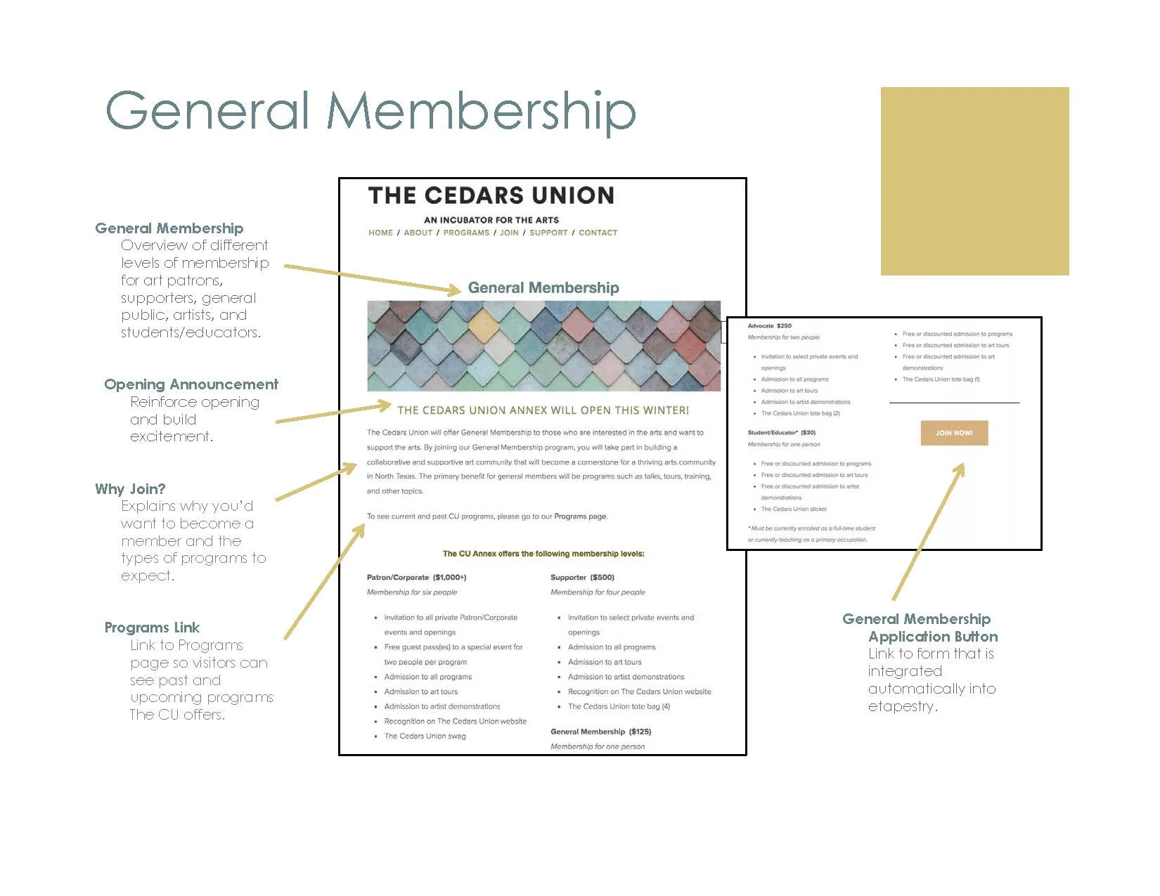
Although we finally arrived at a more simplified version of the General Membership program, we realized that we just weren’t ready to offer membership to the public and decided it needed to be put on hold. Therefore, this page was hidden. At some point we knew we would make this live, so the messaging here would need to be able to inform a wider audience of arts community members why they should join.
Although we eventually postponed launching our General Membership, we continued to do research to revisit our assumptions about our use groups - not only of our website but also of our facility.
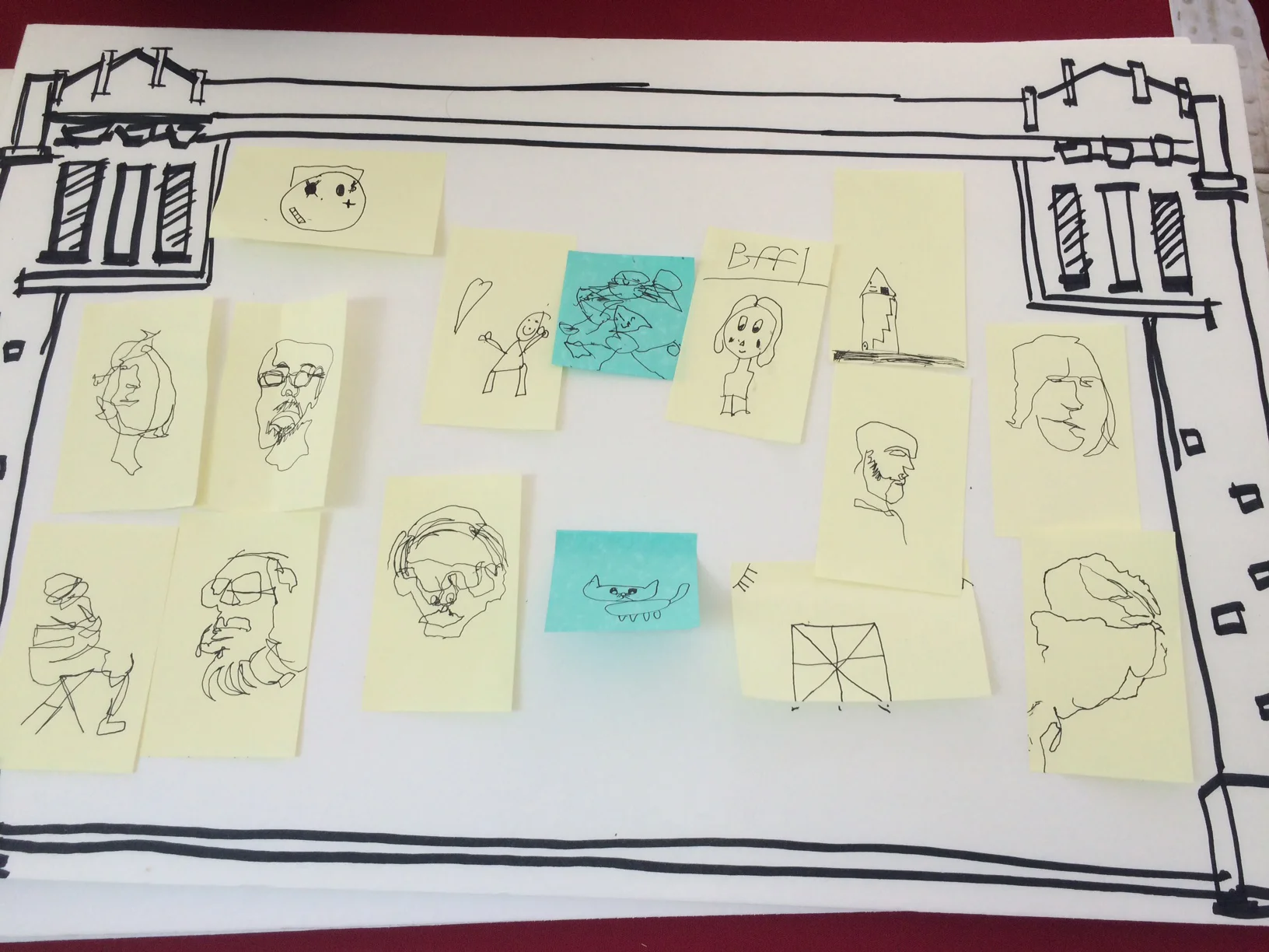
We set up a booth for Voly in the Park at Klyde Warren Park in downtown Dallas. My intern and I got great insight into the types of people who would support The CU during this volunteer recruitment event. Conducting short interviews, I was able to add this information to better formulate our target audience for not only General Membership but also potential donors and of course for volunteers.
Our booth included an activity - having people do blind contour drawings of their friends if they stopped by with someone or of themselves with the help of their cel phones. This activity terrified some people since drawing may not be their strong suit. But it was a great ice-breaker for getting them to open up and share their feelings about why they want to help artists and why they would want to get involved with The CU in some way.
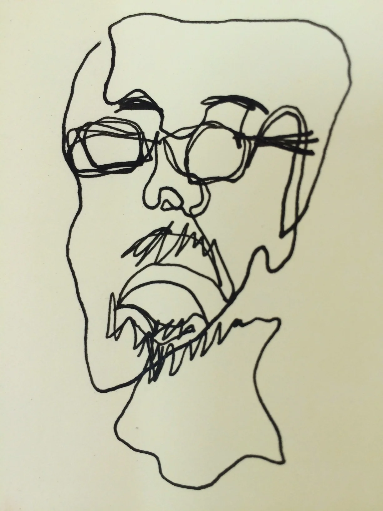
I decided to use the sketches from our Voly in the Park activity for images of CU personas, because hey, we’re all about artists and the people who love them.
Mark is a 45-year old married male living in Dallas. He is an artist who has a BFA in Painting & Drawing but did not pursue a career as an artist because he did not have “rich parents” and needed to support himself. Instead, he used his knowledge gained from his Computer Science minor to pursue a more practical career as first a website designer and later as a game developer. After 20 years as a programmer, he has recently become re-engaged as an artist and would like to “get back into making art.” He also enjoys traveling, tinkering with analog synthesizers, and making cocktails.
Ric is a 22-year-old new media art major who has recently graduated with a B.F.A. from an out-of-state university. He has recently moved to Dallas and is wanting to meet more people in general, but he specifically wants to meet other like-minded artists and designers to talk shop and collaborate with. He is also interested in gaining access to workshop machines and tools that he can’t quite afford on his own yet. He is also not yet prepared to get a studio space of his own. He is looking for work “at a cool place” but is also very interested in getting connected to the creative circles in Dallas.
Sonya is a 67-year-old married female who lives in downtown Dallas and is now recently retired as an attorney. She loves the arts and often goes to see exhibitions at galleries and museums. She has grown children living in other parts of the country so she travels often to see them and while there, she takes in as many shows as possible. Now that she has more free time to pursue her interests, she is wanting to become more involved in the arts. She has become a member of many arts organizations and has recently joined a Board for one of them.
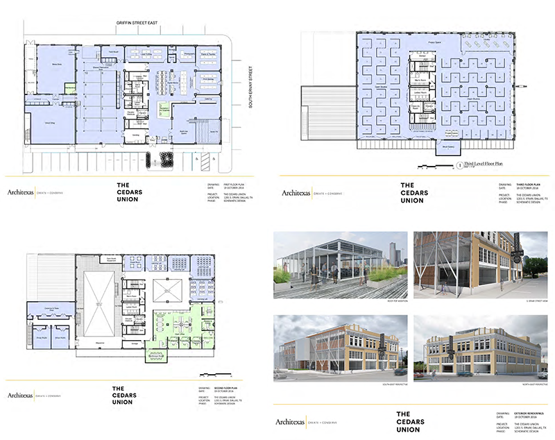
The Cedars Union was originally envisioned to be housed in a large 1920s former ice cream factory in the Cedars neighborhood that was purchased by the co-founders. An architecture firm was hired and many plans were made to transform the building into a massive incubator for artists.
However, soon after I joined The CU, that plan began to unravel, and much of it was due to the City of Dallas’ limitations regarding certificate of occupancy and construction as well as a lack of adequate research into the building, neighborhood, and the City’s very special urban development style. (If you’ve dealt with the City, you know what I mean.)
After having spent a year in construction and fundraising limbo, the stakeholders then decided a solution was needed that could bring the vision of The CU to fruition sooner rather than later. Taking an Agile approach, it was decided that a proof of concept or “lab” would do the trick as a place to iterate the CU’s vision while simultaneously helping with fundraising for the larger building as well.
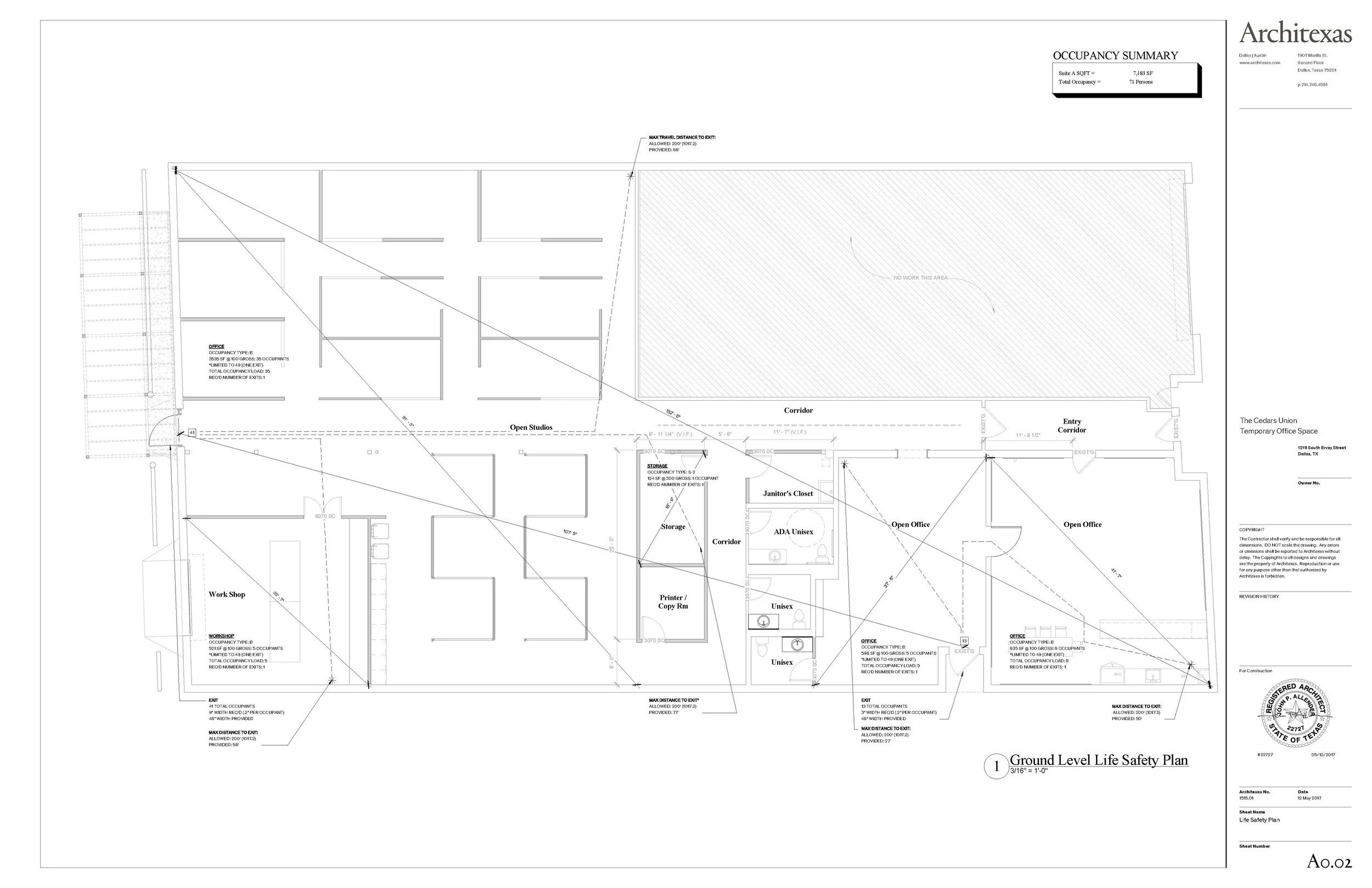
It was then determined that renting the smaller 1950s-era building next door should be the new priority. We then worked with the same architecture firm to design the new space.
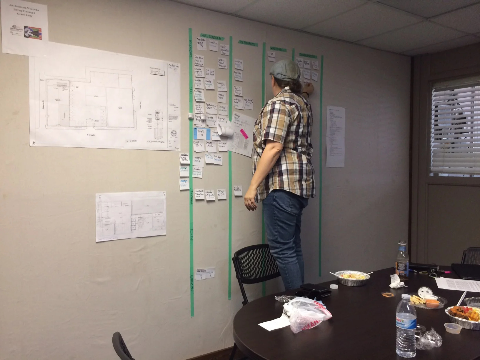
We created a kanban board to track tasks already in progress and all upcoming tasks for the building remodel and for construction of the individual micro-studios.
Although many places might follow different project management methodologies, we were surprised to have to add Waterfall to our mix thanks to the City of Dallas’ bureaucracy and red tape.
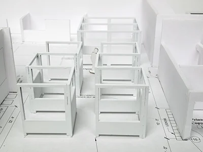
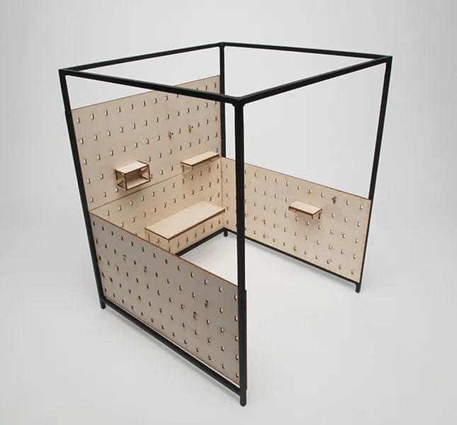
Having introduced lo-fi paper prototyping for space planning at The Menil for its new Menil Drawing Institute and after attending a prototyping workshop at Moogfest, I had the team create foam-core models to iterate designing the new CU facility. This helped us make sure we were coming up with the right solutions based on user research and data we had been collecting from artist interviews, studio visits, focus groups, and surveys.
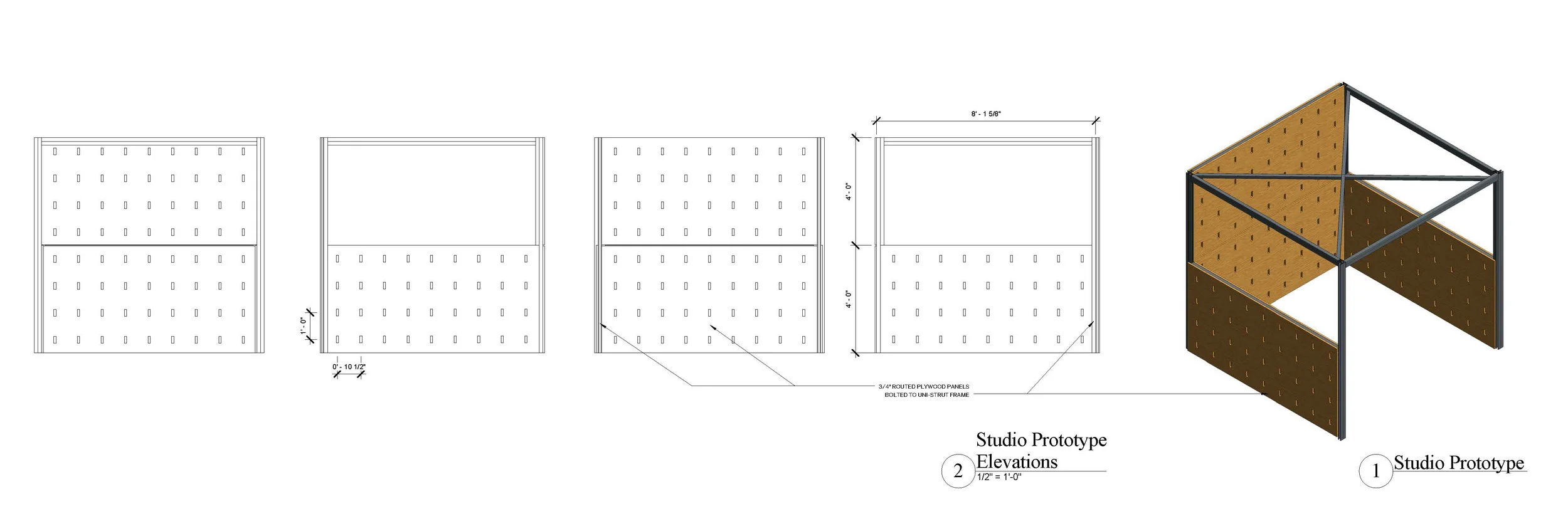
Before I joined The CU, there had been some research carried out that informed the original design of the micro-studio.
The design was changed slightly by adding a crossbar to reinforce the walls.
Although we had continued doing research and gaining insights by providing tours of the facility to artists throughout the construction process, it was also time to put the micro-studio concept to the test to see how it would actually work within the new facility. As construction was being completed and build-out of the studios had started, we brought in artists to get their feedback on our latest iteration of the micro-studio. The biggest takeaway was that we could not keep the crossbar due to the artists pointing out it created shadows into the studio space. So out they went!
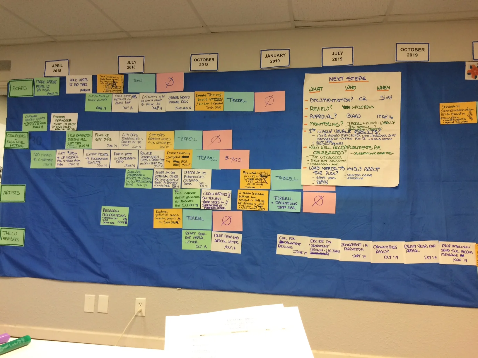
Fundraising was another area of planning that needed to be tackled. We hired a non-profit fundraising facilitator who used the Technology of Participation method for collaborative group work and brainstorming. We identified strategies for fundraising and the 4 groups of people who would help carry out those strategies. We then plotted the tasks, task owners, and goals onto a timeline.